Downloadable PDFs
Logo

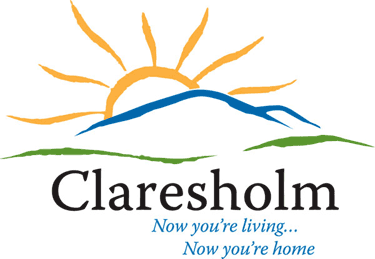
On June 20, 2007, the Town of Claresholm launched its new corporate image. The above logo chosen by the Town is an open, free-feeling logo. It graphically represents “where the wheatlands meet the range.” The wonderful southern Alberta sun is represented setting over the majestic foothills and the plains. The colors used are clear and bright - much like our clear blue skies and wonderfully clean air.
Logo colors are:
Blue: Pantone 2945C
(CMYK equivalent: C 100; M 70; Y 14; K 2)
Tangerine: Pantone 143C
(CMYK equivalent: C 5; M 36; Y 98; K 0)
Green: Pantone 370C
(CMYK equivalent: C 73; M 24; Y 100; K 9)
Substituting of colors is not acceptable. The font used in the logo is Warnock Pro.
The logo and identity work was done by Adair Advertising, Lethbridge.
The logo was registered as an Official Mark in May of 2011.
Please contact Kris Holbeck, CAO at the Town Office for permitted uses.

